Image optimization
Experiences image optimization
Image optimization in Experiences can be effectively managed using Contentful built-in asset manager. This can be achieved in the following ways:
-
Using Contentful built-in components, such as the Image and Structure components, which come with image optimization settings pre-configured.
-
For custom components, you can enable image optimization by including the relevant built-in styles in your component definition. This allows you to optimize your images using the design settings provided in the Design tab.
This guide explains how to use the built-in components and add image optimization to your custom components.
Using the Image component
The Image component is a built-in Experiences component. It allows you to add images to your experiences that benefit directly from image optimization techniques from Contentful Image API. It also provides the best dimensions for your images based on the container’s size and device pixel ratio, helping ensure you deliver the best image quality without downloading images that are larger than necessary.
To add an image to your experience:
-
Drag and drop the Image component from the Basics area of the Components tab to the canvas.
-
With the Image component selected, switch to the Content tab in the right sidebar.
-
Under the Image area, select Asset in the dropdown menu, and click Add asset.
-
Either select Add existing asset to use an image from your existing assets or Add new asset to upload a new image. Once an asset has been selected, it is rendered in the canvas.
-
With the image rendered, select the Design tab and view the Image size, Image optimization, and Image fit properties.
Image component design properties
Image size
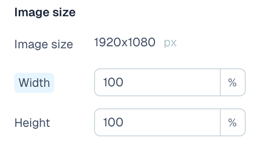
The image size property displays the image’s intrinsic height and width, followed by inputs to adjust the image size when rendered in an experience. Based on the width you select, the image is resized to fit the container, so the browser doesn’t need to download an image larger than necessary.
If you select a relative unit for width (e.g. %), a new “Target width” option is displayed. This allows you to enter the image’s absolute width (px, em, or rem) to help the image API deliver the best-sized image.
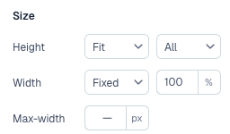
Image fit

The Image fit allows you to control how the image is displayed within the container, mainly when you adjust the image aspect ratio by setting the height or width to a new value.
- The Scaling options include:
- Contain - The image is resized to fit within the container, maintaining the image’s aspect ratio. It’s letterboxed if necessary.
- Cover - The image is resized to cover the entire container, cropping the image if necessary.
- None - The image is displayed at its original size, ignoring the container’s dimensions.
- H alignment (horizontal) and V alignment (vertical) options allow you to control how the image is aligned within the container.
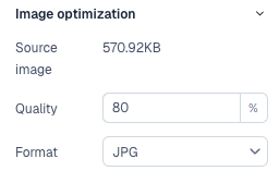
Image optimization
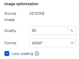
The Image optimization allows you to control the quality of the image through various settings:
- The Quality setting allows you to adjust the image’s quality when rendered in the browser. A lower-quality setting results in a more compressed image, but with less visual fidelity.
- The Format dropdown allows you to change your image file format. By default, the original format is selected, but adjusting it to a different one can help reduce the file size while maintaining the image quality. For example, ‘webp’ or ‘avif’ formats are more efficient than ‘jpeg’ or ‘png’ - however, they might not be supported by all browsers.
- The Lazy loading option defers loading your image until it’s in the viewport, helping to reduce the initial page load time. With this option deactivated, the image is loaded immediately, which may be necessary for images critical to the user experience.
Add background images to structure components
Background images can be applied to the built-in Structure components: Section, Container, and Columns. When a background image is added, these components leverage Contentful Images API to optimize the image automatically, ensuring the best quality and performance.
To add a background image to a Structure component:
-
Drag and drop a desired Structure component to the canvas.
-
With the Structure component selected, switch to the Content tab in the right sidebar.
-
Under the Background Image section, select Asset in the dropdown menu, and click Add asset.
-
Select Add existing asset to use an image from your existing assets or Add new asset to upload a new image. Once an asset has been selected, it is rendered in the canvas.
-
With the background image rendered, the Design tab on the right displays Background image and Image optimization properties.
Background image design properties
Size section
The Size lets you adjust the dimensions of the container where the background image will be displayed. When you have the width set to a relative unit (e.g. %), a new “Target width” option will appear in the “Background Image” section. This allows you to enter what you think the container’s absolute width (px, em, or rem) will be to help the image API deliver the best-sized image.
Background image
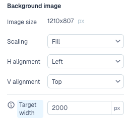
The Background image allows you to control how the image is displayed within the container, mainly when you adjust the image aspect ratio by setting the height or width to a new value.
- The Scaling options include:
- Fill - The image is resized to cover the entire container, cropping the image if necessary.
- Fit - The image is resized to fit within the container, maintaining the image’s aspect ratio. It is letterboxed if necessary.
- Tile - The image is displayed at its original size, ignoring the container’s dimensions. It repeats if necessary to fill the container.
- H (horizontal) and V (vertical) alignment options allow you to control how the image is aligned within the container.
- The “Target width” option appears when you have a relative (%) value set for the container’s width. This allows you to enter what you think the container’s absolute width (
px,em, orrem) will be to help the image API deliver the best-sized image.
Image optimization
The Image optimization allows you to control the quality of the background image through various settings:
- The Quality setting allows you to adjust the image’s quality when rendered in the browser. A lower-quality setting results in a more compressed image, but with less visual fidelity.
- The Format dropdown allows you to change your image file format. By default, the original format is selected, but adjusting it to a different one can help reduce the file size while maintaining the image quality. For example, ‘webp’ or ‘avif’ formats are more efficient than ‘jpeg’ or ‘png’ - however, they might not be supported by all browsers.
Enable image optimization for a custom image component
To enable image optimization for a custom image component, include cfImageAsset and cfImageOptions in the builtInStyles array of your component definition:
The cfImageAsset variable is used to select the image to display, and cfImageOptions allows you to customize the design settings for the image, such as width, height, object fit, object position, quality, and target size.
With these variables set, a cfImageAsset prop is passed into your component that contains various metadata you can use to construct your img tag. The key values to focus on are:
cfImageAsset.url- The URL of the original image. This isn’t the optimized version, and you can set this to thesrcattribute of yourimgtag for fallback purposes.cfImageAsset.srcSet- This array provides a list of optimized image URLs that can be combined and assigned to thesrcsetattribute of theimgtag. This allows the browser to choose the best image based on the container’s size and device’s pixel ratio.cfImageAsset.loading- Contains the value for the Lazy Loading option and can be set to theloadingattribute of theimgtag.cfImageAsset.sizes- Contains either the value of the container’s width (if it’s a fixed unit) or the value of the Target width option. This can be set to thesizesattribute of theimgtag.
See the implementation of our built-in image component for an example of how to use these values to construct an img tag.
Enable image optimization for backgrounds on a custom image component
To enable image optimization for a background image on a custom component, include cfBackgroundImageUrl and cfBackgroundImageOptions in the builtInStyles array of your component definition:
The cfBackgroundImageUrl variable is used to select the background image for the component. cfBackgroundImageOptions variable allows you to customize the design settings for the background image, such as scaling, alignment, quality, and target size.
With these variables set, the CSS that gets applied to your component includes the background image automatically.
className prop to the element you want the background on.